
Responsive Web Development Services
Delivering websites that adapt seamlessly across all devices, ensuring superior user experiences and performance.
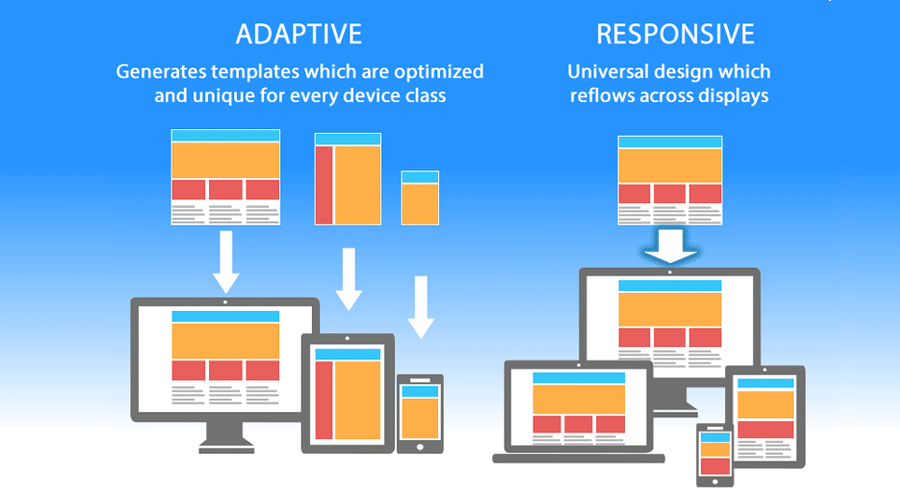
- Device Agnostic: Websites adapt flawlessly to mobile, tablet, and desktop screens.
- Enhanced User Experience: Designed to offer optimal performance across all screen sizes.
- SEO Friendly: Boost your search rankings with mobile-first designs.
- CCross-Browser Compatibility: Ensuring consistency across popular browsers like Chrome, Firefox, Safari, and Edge.
Process
- Requirement Analysis:
Understanding your audience and the key devices they use. - Design Mockups:
Crafting wireframes and mockups focused on fluid grids and scalable images. - Development:
Utilizing the latest frameworks like Bootstrap or custom media queries for responsiveness. - Testing:
Extensive testing across devices, including mobile, tablet, and desktop. - Optimization & Launch:
Fine-tuning performance for faster loading and SEO enhancements before going live.
FAQ
It allows your website to adapt to any screen size, providing an excellent user experience and improved SEO.
Yes, we can enhance your current website to make it fully responsive.
It depends on the complexity, but typically it takes 2 weeks.